Casa Bramble
Casa Bramble is a self-initiated concept project — an invented boutique hospitality group made by the studio to demonstrate its approach to a full identity system. It was not commissioned by a real business.
01 — Challenge
- A small group of boutique guesthouses in Barcelona had grown from one property to three, each with its own hand-made signage and no shared visual language between them.
- The brief called for a system flexible enough to work across print (menus, key tags, signage) and digital, without losing the warmth a hospitality brand needs.
- No existing brand assets were usable as a starting point — the identity had to be built from zero, under the constraint of a genuinely tight, boutique-scale budget.
02 — Approach
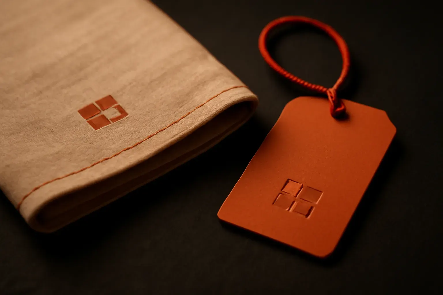
We started, as always, with Survey — reading the three properties in person (in this concept, as a site visit brief), noting what already worked (the warm, handmade signage tone) and what didn’t (zero consistency between locations). The Found stage settled the one decision everything else hangs from: a mark built from the same corner-notch language the studio itself uses, reinterpreted as a monogram for the group’s initials, paired with a warm, paper-forward palette that would read the same on a room key as on a napkin. Build applied that system across the full touchpoint list the brief called for — signage, menus, key tags, a simple digital presence — testing it at the smallest physical scale first (a key tag) since anything that survives at that size survives everywhere larger. Finish delivered the documented guidelines and source files a hospitality group with no in-house designer could actually apply themselves, including guidance for briefing a signage fabricator who’d never seen the system before.
03 — Gallery
Device-frame composition: a print-spread outline containing abstract colour-block placeholders in --tint-bi (amber), plus a small type specimen showing "Casa Bramble" set in 2–3 weights of the identity’s primary typeface, as it would appear across signage, menu and key-tag scale.
04 — Outcome
- A mark that reads at napkin scale and signage scale without redrawing — the corner-notch monogram survives both because it was tested at the smallest scale first.
- A single documented rule-set meant a signage fabricator with zero context could brief correctly on the first attempt — the guidelines did the explaining, not a phone call.
- The warm, paper-forward palette carried a boutique-hospitality tone through print pieces without the identity ever needing a second, "softer" colour system for those touchpoints.
Need a system like this for your own business?