Solvane
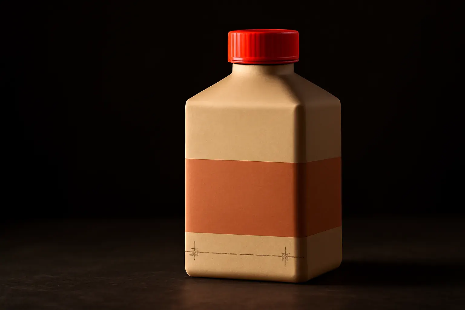
Solvane is a self-initiated concept project — an invented packaged-goods beverage brand made by the studio to demonstrate its approach to a packaging system that also had to extend into social content. It was not commissioned by a real business.
01 — Challenge
- A beverage brand launching a four-SKU range needed packaging that read as one family on a shelf, not four separate label jobs designed in isolation.
- The previous packaging attempt (in this concept, a placeholder first pass) had come from a digital-first designer with no dieline experience — the files wouldn’t have survived a real print run.
- The brand also needed the same system to extend into social content post-launch, so the packaging system had to be designed with a second life in motion already in mind.
02 — Approach
Survey covered the category shelf — what four competing beverage brands’ packaging actually does at arm’s length in a shop, not just on a screen — and the physical constraints of the client’s chosen bottler. Found locked the dieline and structural system across all four SKUs at once, so variety between flavours came from colour and label graphics within one fixed structure, never from redesigning the bottle shape per SKU. Build produced print-ready files SKU by SKU against that shared structure, plus — since this project crosses into Motion & Social — a first batch of social assets built from the same colour system, proving the packaging’s visual logic survived the jump from bottle to phone screen. Finish delivered a production spec sheet a bottler could run against directly, plus the brand-consistency notes a future in-house social effort would need to keep the system intact.
03 — Gallery
Print-spread device frame containing abstract colour-block placeholders in --tint-gp (rust red), showing four SKU variants sharing one dieline structure, plus a small type specimen of "Solvane" set for label-scale legibility.
04 — Outcome
- One fixed dieline structure across four SKUs meant flavour variety came from colour and graphics, not four separate structural redesigns — cheaper to produce and more coherent on shelf.
- A production spec sheet the bottler could run against without a follow-up call — the craft claim this service makes is measured off-screen, and it held.
- The packaging’s colour system proved portable into social content, confirming the structure was designed for a second life in motion from the start, not adapted after the fact.
Launching a multi-SKU range?